Project management incorporates juggling different aspects of projects simultaneously, for example, tasks, timelines, and deliverability. What’s more, the project manager is the default go-to person to deal with every one of these aspects. Nonetheless, they’re not superhumans. The role of managing projects is hard when you run a few without a moment’s delay and have interlinked tasks and roles. From predicting courses of projects to make sure the tasks are completed, managing everything on time gets problematic.
In the event that the above scenario appears to be natural, you ought to consider utilizing a project management dashboard template for tracking your projects. This saves you a ton when you are hard in a rush and need to productively monitor project performance in a sorted out fashion.
Today, there’s no dearth of project management dashboard tools on the web. Nevertheless, a good way to improve project outcomes is to use a template that highlights the benefits and concerns of the project and displays information in a simple, coherent, and graphical way.
A project management dashboard in HappyFox BI offers unlimited opportunities to incorporate charts and important information at the same time. Read on to know more about the varying components of an ideal project management dashboard template.
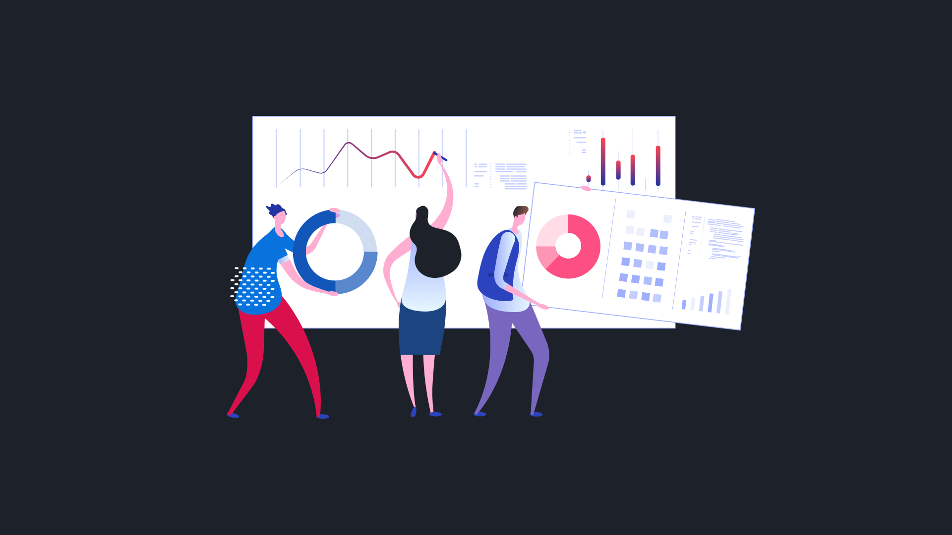
Project Management Dashboard with HappyFox BI

Sample project management dashboard inside HappyFox BI

The core key performance indicators (KPIs) of a project are the timeline and the current project status. It should also include the task status, overall project completion states, pending items for the projects, etc.
Let’s take a look at the different components of the HappyFox BI based Project Management Dashboard template, and how information can be inserted into it to generate results.
1. High-level, easily digestible project health indicators

Get a bird’s eye view of your team’s progress on different projects. Create data tiles to highlight the current status of the different projects, along with some numbers on the completed and overdue ones.
Quickly find out the task trends, compare it with completed tasks, and your target to know where you stand.

2. Project task details
Project task details embodies visualized the progress of tasks that are to be completed under a project. It is also key to highlight who might be working or driving these specific tasks. The beginning and end dates feature must feature for every one of these tasks. You should also be able to highlight or filter the tasks on priority and make sure that they are completed first.

3. The volume of tasks that are still pending
At the end-goal level, you would want most of the tasks to be completed well within the expected time frame. For tasks yet to be completed, the details would help unearth out the potential bottlenecks in the project.

A line chart would provide an easy representation of the count of the tasks still remaining in the pending state as a part of the project status dashboard. Drill-downs should help you directly land inside those tasks which were still long overdue and pending.

4. Average Time Spent to Complete Tasks
The Average Time Spent to Complete Tasks widget, gives a quick glimpse of the effort taken by your teammates to complete tasks. This metric is critical to evaluate how well your team is performing towards the fulfilment of your project’s goal.

5. Distribution of Tasks by Custom Fields
Almost every project management tool these days offer the option of adding “Custom Fields” to tasks to further categorize tasks under different properties. This means, a visualization of the count of tasks under a particular custom field value would give insights into the variety of tasks your team is working on.

Conclusion
Business intelligence dashboards for project management offer deep insights on resource utilization, project performance, and your adherence to timelines. Therefore, not only do you make better decisions in your current project, but also make project management decisions in the long run, by using a good project management dashboard.
With HappyFox BI, you will be able to perform cross-functional reporting and analytics. You get the tools and widgets in order to make the right decisions based on data and accelerate your organizational growth.
‘Get a demo’ of HappyFox BI and get started your analytics journey.