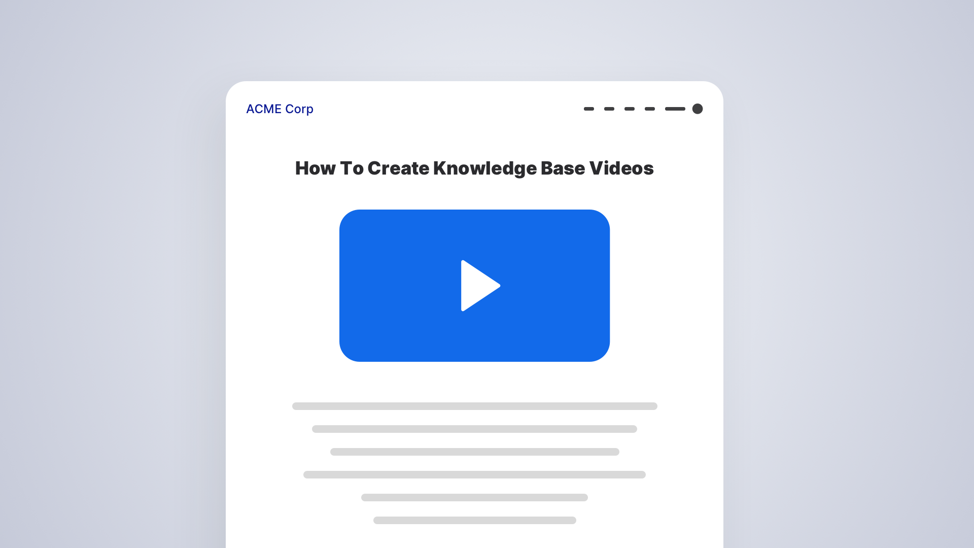
Every brand across the world puts in a lot of effort in designing their knowledge base, ranging from what color the font should be to where to place the feedback form. But, do looks really matter?
94% of website users’ first impressions are influenced by how the website looks. Good visuals are appealing, comforting, and, most importantly, effortless. How many of you have chosen one brand over another sheerly due to better visuals? Visuals particularly have a huge impact on your knowledge base experience. The knowledge base is designed for customers in need, which calls for visuals that reflect what your knowledge base stands for.
That is why a virtual reality knowledge base looks avant-garde and quirky, and a mental health knowledge base looks professional and self-assured. A vice versa of personas may not work because it risks pulling in the wrong crowd. Visuals indeed maximize the appeal of a webpage or a site. But what do visuals represent in a knowledge base?
Visuals reflect your brand personality
The visuals of your knowledge base make your company’s persona. Is it a helpful advisor? A thought leadership guide? A knowledgeable friend? Only your visuals can tell. Whatever user interaction happens on the user’s screen, whether it is a visual interaction like a pop-up widget or an action like clicking a button, all of it falls under the bracket of visuals. Simply put, the “look and feel”.
Look
“Look” is the visual interaction between the user and your webpage. Everything from the layout, color palettes, fonts, and the overall styling fall under the look.
Feel
Even though a website is not a physical object, users “feel” the website through the responses of a button, scroll movements, sound effects, load time, etc.
A combination of the right look and feel makes a wow-worthy visual for your knowledge base.
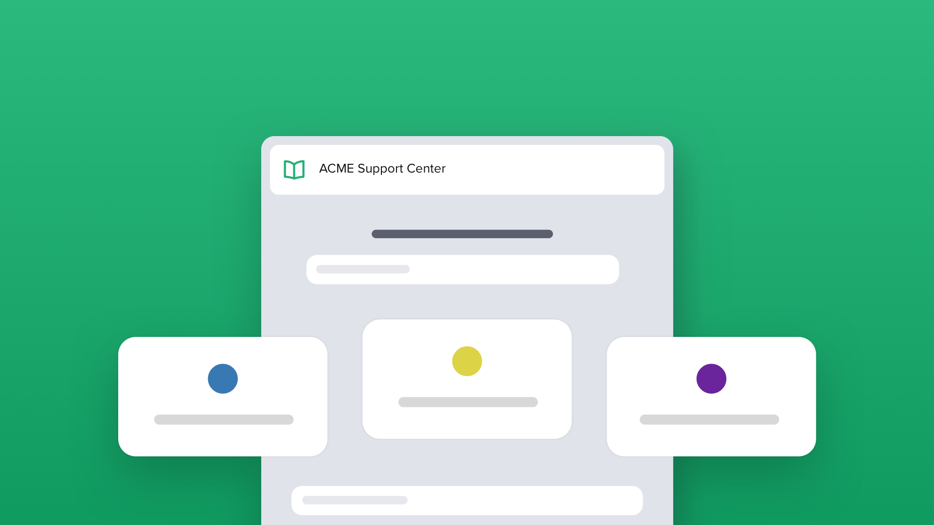
Better Visuals drive a better knowledge base experience
Your knowledge base is a crucial part of your customer support. Customers seeking quick solutions for common issues or faqs at any time of the day would benefit immensely from your knowledge base. However, your knowledge base should make a good first impression to keep customers coming back. If your knowledge base is riddled with too many visual elements or unconventional visuals that users are not accustomed to, they may find it challenging to navigate. The customer may end up calling your customer support team, which defeats the whole purpose of a knowledge base.
It takes only 50 milliseconds for a customer to form an opinion about a webpage. Strengthening your knowledge base visuals would lead your customers to engage more with self-service than assisted support.
Parameters of knowledge base visuals & how to improve them
Appearance
The appearance of your knowledge base is what captures the user’s attention. The choice of color, fonts, and templates should reflect your company’s persona, and customers must be able to recognize your company online. If you are creating knowledge base content for Stark Industries, your colors can’t be pink and yellow. If you are using a product screenshot, use a free tool like Canva to stylize it. The options are endless.
Finally, make sure your font can be read on any browser for the best user experience – high contrast font to background ratio is typically recommended.
Structuring
Make sure that your knowledge base features are structured properly. Structuring means positioning the features appropriately on a page to optimize their usability and search function. It must be easily navigable, and if there are a lot of elements involved, a browser or search bar on the home page is a must to improve the searchability. You can use structuring to create an information hierarchy of popular articles, SEO-based articles, faq pages, common questions, old/new articles, and much more.
Speed
Another thing that will put off your customers is not being able to see parts of the article. Your articles will contain screenshots, GIFs, and video tutorials, and it is a thumb rule to minimize the load time. Make sure that the obvious information is shown immediately. We as users know that every second on the internet, waiting for something feels like an eternity. You can check your page speed insight using Google PageSpeed Insights and Google Analytics. So before you use heavy graphics and animations, make sure your site loads in the minimum time possible.
Mobile Version
Navigating through the internet has changed over the years. Your customers are likely going to check for solutions on your knowledge base tool using their mobile phones. If your site isn’t optimized for a mobile screen, the customer experience gets compromised. Make sure that your website is user-friendly and performs well on any screen without reduced functionality.
Customer Feedback
You need to let your webpage interact with your customer base. Your customers must be able to search for your knowledge base articles, view related articles, give feedback, and share them on their social media. A chatbot or live chat option will help your customers directly jump to a chat with a support agent if they need more help with troubleshooting. You need to devise a seamless workflow for the transition from self-service to assisted support.
Anyway, content is where the real value is
While visuals are crucial to your knowledge base, the content is where the real value is. Some people might even suggest that beautifully written articles are much better than beautifully looking articles. It is best to put an equal amount of effort into both the visuals and the content for better customer satisfaction.
HappyFox Helpdesk has a highly customizable, ready-to-go, and effective Knowledge Base software for your self-service portal. Sign up for a one-on-one demo today!