Data visualization is the graphical representation of your data, allowing you to understand trends, outliers, and patterns in data quickly.
When done right, visualizing data can be a powerful tool to derive insights into information, accelerating decision making. However, to choose the right type of data visualization, you need to understand what visualization type to use and why. In this blog, we’ll discuss how to choose the right one and the different types of data visualizations available in HappyFox BI.
- Bar Chart
- Line Graph
- Histograms
- Doughnut/Donut Chart
- Multi-Axis Line Chart
- Pareto Chart
- Region Maps
- Treemap
- Word Cloud
- Data Tile
How to choose the right visualization?
To Compare:
The following types of data visualization techniques are helpful if the goal is to compare two or more categories of data. A subtype of these is Time Series charts, where the visuals illustrate trends in data over a period of time. To compare your data, some of the top choices are:
- Bar Chart
- Line Graph
- Multi-Line Access
- Bubble Chart/Bubble Map
To Show Composition:
Composition charts are perfect to analyze what data components make the whole of something. With composition charts, it is easy to focus attention on the importance of each part concerning the total value. Some chart types available are:
- Stacked Charts
- Doughnut/Donut Chart
- Maps
- Area Charts
To Aggregate:
These are visually appealing indicators or tables that can show an instant overview of a particular KPI. It allows you to have a consolidated and aggregated view of your variable across a category. Some examples of this type are:
- Summary Table
- Data Tiles
- Pivot Table
To Prioritize:
These are powerful charts that allow readers to segment into their quantitative data into the categories. These types of charts are beneficial for multi-perspective analysis and identifying niches with specific needs. Some of the most used prioritization charts are:
- Pareto Chart
- Segmentation Chart
To Understand the Distribution:
Distribution charts are used to show how variables are distributed, helping identify outliers and trends, and understanding how individual data points are distributed within the broader data set. The most common types of charts are:
- Histogram
- Treemap
- Word Cloud
- Box Plot
- Tree Diagram
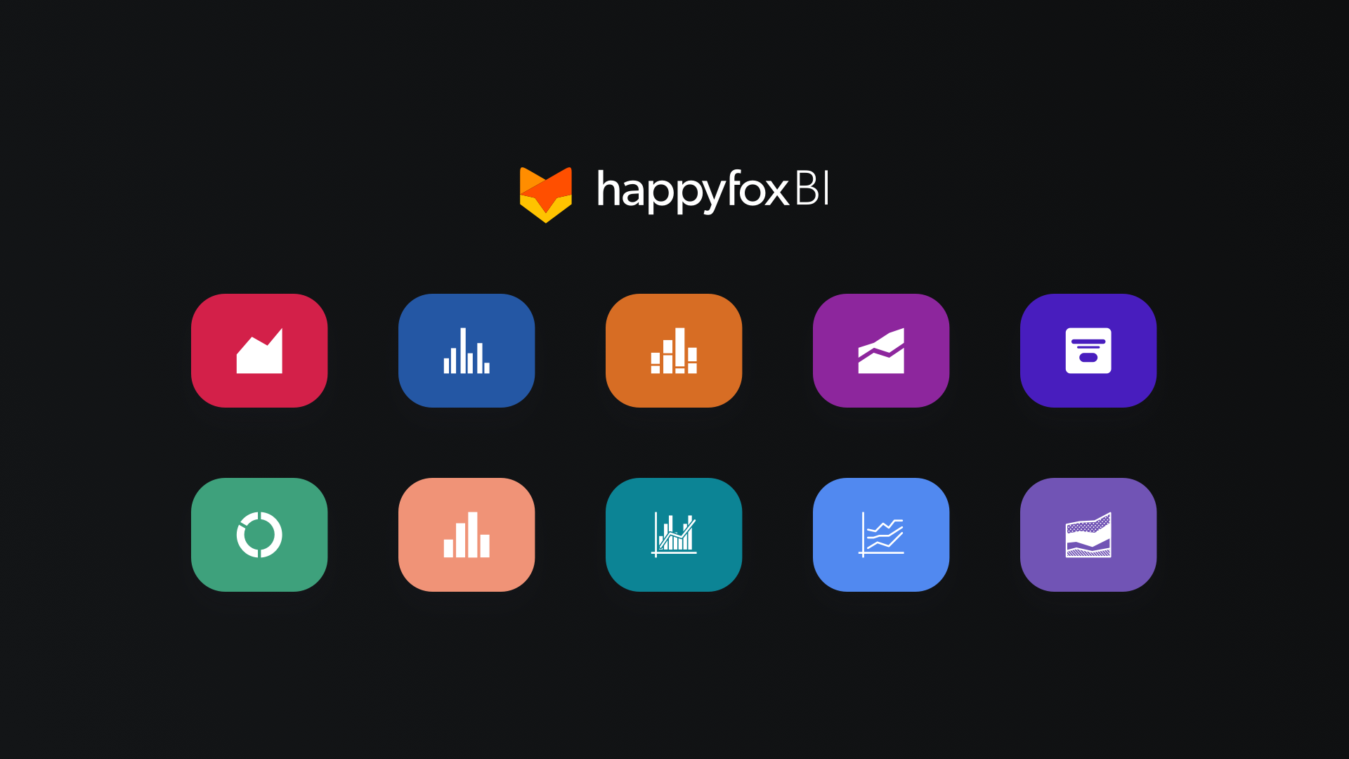
10 Data Visualizations in HappyFox BI Platform
| Viz ↓| Use → | Compare | Composition | Aggregate | Prioritize | Distribute |
| Bar Chart | ✔ | ||||
| Line Chart | ✔ | ||||
| Histogram | ✔ | ||||
| Doughnut Chart | ✔ | ||||
| Multi-Axis Line Chart | ✔ | ||||
| Pareto Chart | ✔ | ||||
| Region Maps | ✔ | ||||
| Treemap | ✔ | ||||
| Word Cloud | ✔ | ||||
| Data Tile | ✔ |
Bar Chart
Bar charts are a simplified graph where you can organize data into rectangular bars to compare related categories in the same data sets easily. It presents categorical data with heights or lengths proportional to the values that they represent and can be vertical or horizontal.

Line Graph
Line Graphs are used to display quantitative values over a continuous interval or time period. Line Graphs are most frequently used to show trends and analyze how the data has changed over time.

Histogram
A histogram is a type of visualization that shows the distribution of univariate data set, where the area of the bar that indicates the frequency of occurrences for each bin. Histograms give an estimate as to where values are concentrated, what the extremes are, and whether there are any gaps or unusual values throughout your data set.

Doughnut Chart
A Doughnut chart is a quick visual representation of your metrics when you want to compare relative values or compare parts of a whole. It is a variation of a Pie chart, except it has a round hole in the center, which makes it look like a donut.

Multi Axis Line Chart
A multi-axis line chart is an interactive line chart that can be configured for multiple axes. It allows multiple y-axes to be rendered in the same chart.

Pareto Chart
A Pareto Chart is a graph that indicates the frequency of problems or causes in a process and its cumulative impact. It is based on the 80/20 principle, which states that, for many events, roughly 80% of the effects come from 20% of the causes. Pareto Charts are useful to find the defects to prioritize to observe the greatest overall improvement.

Region Map
Maps are a captivating visualization to tell a story for your business data geographically. Through this, you can visually see the distribution or proportion of data in each region, across the world, country, state, and even streets!
This gif below shows much revenue has been generated in Sales by the company, country wise and where the potential is to make more. For instance, $93,111,000 or 93M in Revenue came from India.

Tree Map
A Treemap is a visualization that displays hierarchical data using nested rectangles of varying sizes and colors, showing quantities for each category via area size.

Word Cloud
Word Cloud is a visualization method that displays how frequently words appear in a given sample of text. If you want to highlight crucial textual data points, these are a stunning visualization as more the frequency, the bigger the words appear.
The following visualization indicates that Maya is the top Service agent with the highest First Response Time.

Date Tile
A Data Tile is an eye-catching visualization that allows a quick glimpse into quantitative or categorical data. With a strong label, these visualizations can provide you with precise and powerful KPIs. The following Data Tile shows that Fred is the top Sales Agent generating $274K revenue for his company as recorded in the Salesforce CRM.

Conclusion
Some other important types of data visualization that are widely used in the industry are the Scatter Plot, Heat map, Gantt Charts, Funnel Chart, etc. Data analysis to identify trends and clusters, detect outliers are one of the most crucial strategies business leaders undertake when looking to make insight-driven decisions.
With the right data visualization tool like HappyFox BI, you don’t just have access to over 20 (and growing!) no-code, ready-to-use types of visualization but also a great library of inbuilt industry-accepted reports. If you’re looking to make sense of your data, check out our BI tool here or sign up for one to one demo.