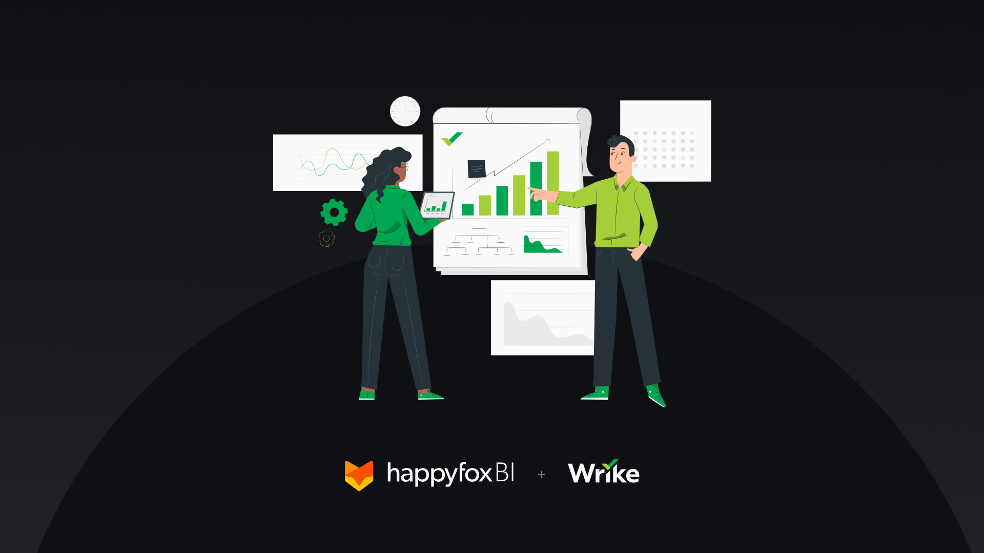
Dashboards are a great way to visualize your most important project management KPIs and also can be used to supercharge your team to achieve exceptional results. They likewise help you to bring together many key visual analytics under a single roof. With HappyFox BI, you get a quick glance into your Wrike project management metrics to get the insights that matter most to you.
Before you embark on your dashboard customization journey, there are a few simple things you need to think about first to ensure you have a seamless transition. Continue reading to discover six steps we think you should keep in mind before building your first Wrike dashboard on HappyFox BI.
Step #1: Connect your Wrike account with HappyFox BI
When you log into your HappyFox BI account, you can quickly and easily integrate Wrike to your account and start getting real-time insights on your projects. You can also integrate multiple Wrike Project Management accounts to your HappyFox BI instance and build cross-departmental reports.
Already using HappyFox BI to gather business insights? Click on the below link to for a step-by-step guide to integrate Wrike with HappyFox BI ⤵

Step #2: Determine different report pages of your Wrike Dashboard
One of the most useful ways to categorize a dashboard is by the type of business activity that it corresponds to. For project management, some examples of report classification include Project Portfolio Dashboard, Task Overview Dashboard, Timesheet Dashboard, etc. The main goal of a report curator is to build the right type of dashboard for each of the various decision-makers in your company.
HappyFox BI adopts a three-tier hierarchy for dashboard visualization:
Reports → Pages → Visualizations
Each report can have multiple report pages and every report page can have its own unique set of widgets.
From the left navigation bar, you can create reports and add report pages underneath them. Clicking on each report page opens up the widget canvas, where you can create, resize, and re-align different widgets!
Step #3: Use pre-built templates to automatically populate widgets
The goal of a dashboard is to keep it simple for the report viewer. You must cherry-pick your most import KPIs to showcase in prominent areas.
One way to narrow down your important KPIs is by deciding which ones are key and actionable. Important KPIs are ones that report viewers can analyze and get impacted. Visualizing these types of KPIs are important because onlookers will be inspired or motivated by the project performance.
Learn more about key project management KPIs that you must track.
Also, consider what you want the outcome of the dashboard to be. To use an example from a software department, if the goal is to drive more sprints on your software team then a development dashboard should primarily be dedicated to displaying your past/present sprint performance and key metrics such as bug resolution timeframes.
HappyFox BI has over 25+ prebuilt Wrike widget templates catering to different departments and functions to choose from. There curated report-wide templates for instant metric tracking and analysis. It is also important to note that these widgets are highly customizable and we’ll cover that in the subsequent section.

Step #4: Fine-tune your dashboard design by re-aligning widgets
Your dashboard needs to be uncluttered, easy to understand, use different visualization, and also have the easily digestible information in the top (say, active tasks, project completion percentage), as this is where the human eye naturally begins reading from.
It’s also a good idea to use the most appropriate widgets for the type of data you are trying to display. For example, pie charts are not good to display more than two data categories as they are hard to understand at a glance. For larger comparison, it is advisable to use bar charts as they offer multi-column support.
While there is no hard and fast rule for dashboard design, it is important to keep in mind that the report viewer should get the complete picture when viewing the dashboard.

Step #5: Mix and match data, create your own custom widgets for advanced analytics
For advanced analytics, you can create your own visualizations in HappyFox BI using the create visualization option. With a variety of data sources available for Wrike – Tasks, Projects, Folders, Spaces, and Task History, you can envision them in over 25+ visualization to gather unique insights. If you’re subscribed to other HappyFox BI offerings viz Aircall, HappyFox, etc. you can even mix and match project management data with call center or help desk data for cross-functional analysis.

Step #6: Decide who is going to use the dashboard
Different people in your company will have different things they are looking for in a dashboard. For example, an executive dashboard designed for your CXOs or your board will need to be easy to understand as they may not be familiar with working with dashboards on a daily basis and are not used to seeing data presented in this way.
For Project Managers, a more detailed dashboard is expected with project timelines and individual widget drill-downs.
With HappyFox BI, you can specifically set who gets access to which report through the reports customizations section.

Conclusion
Integrating your Wrike data to HappyFox BI will allow you to craft beautiful project management reports for different people in your organization. With intuitive Dashboards, you are can get a complete picture of your projects and easily pass this on to your key decision-makers or the board. We hope this blog gave you enough information on getting started with your first dashboard for Wrike!
If you have any further questions regarding HappyFox BI, or if you’d like to try out the product, please feel free to book a one-on-one demo with our product experts.